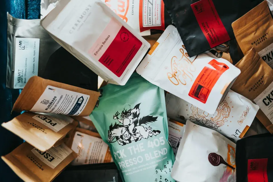
CoffeeBox's packaging article asks how a bag's color can shape expectations before the beans are opened. A dark design may suggest intensity to one shopper, while pale or bright colors may imply a lighter or fruitier style. Those associations can vary with brand, context and personal experience; they are not a universal coffee code.
A package does not establish acidity, sweetness or roast by its color alone. Read the actual label for coffee identity, process, roast information and date details. A black bag can contain a delicate light roast, just as a pastel bag can contain a coffee intended for a substantial milk drink. Marketing language also deserves the same scrutiny as design.
To explore expectation, taste a coffee before looking at the bag and record a few broad impressions. Compare them with the description afterward without forcing agreement. That exercise can reveal how much vocabulary guides attention, but one informal trial does not prove a neurological mechanism. The practical buying lesson is simple: enjoy attractive packaging while choosing from the coffee's documented details and your own experience rather than the palette alone.
The conversation
A good question can make a better brew.